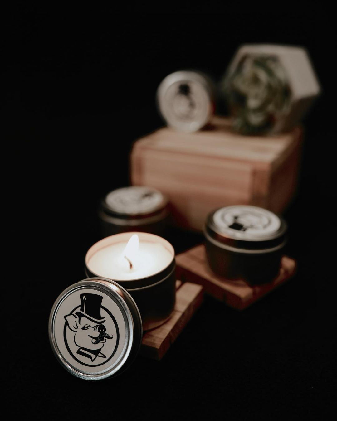


The objective of this design was intended to be printed as a sticker and placed primarily on a round metallic grey tin. Check out the Brand Story! One of the challenges was that the design itself was not in any means symetrical or easily centred. To overcome this the stoke of the circle itself varies in thickness, and the section of the pig’s ear, as well as the top hat, overhang the boundaries of the frame. This design is monochromatic and not intended to be altered in colour,. However, the brand has reviewed options to branch out during certain seasons such as Autumn or cultural celebrations such as Christmas. In this case the flame of the top hat could be altered, for example: swapped out for “holly” during the December launch. New colours could also be introduced during these special launches.


